E-commerce redesign
Rakuten
Helping shoppers see the points they'll earn, and who they're buying from, before they click
- Role
- UI/UX and visual design
- Industry
- E-commerce
- Contribution
- Prototyping, component library
- Platform
- Web, desktop and mobile

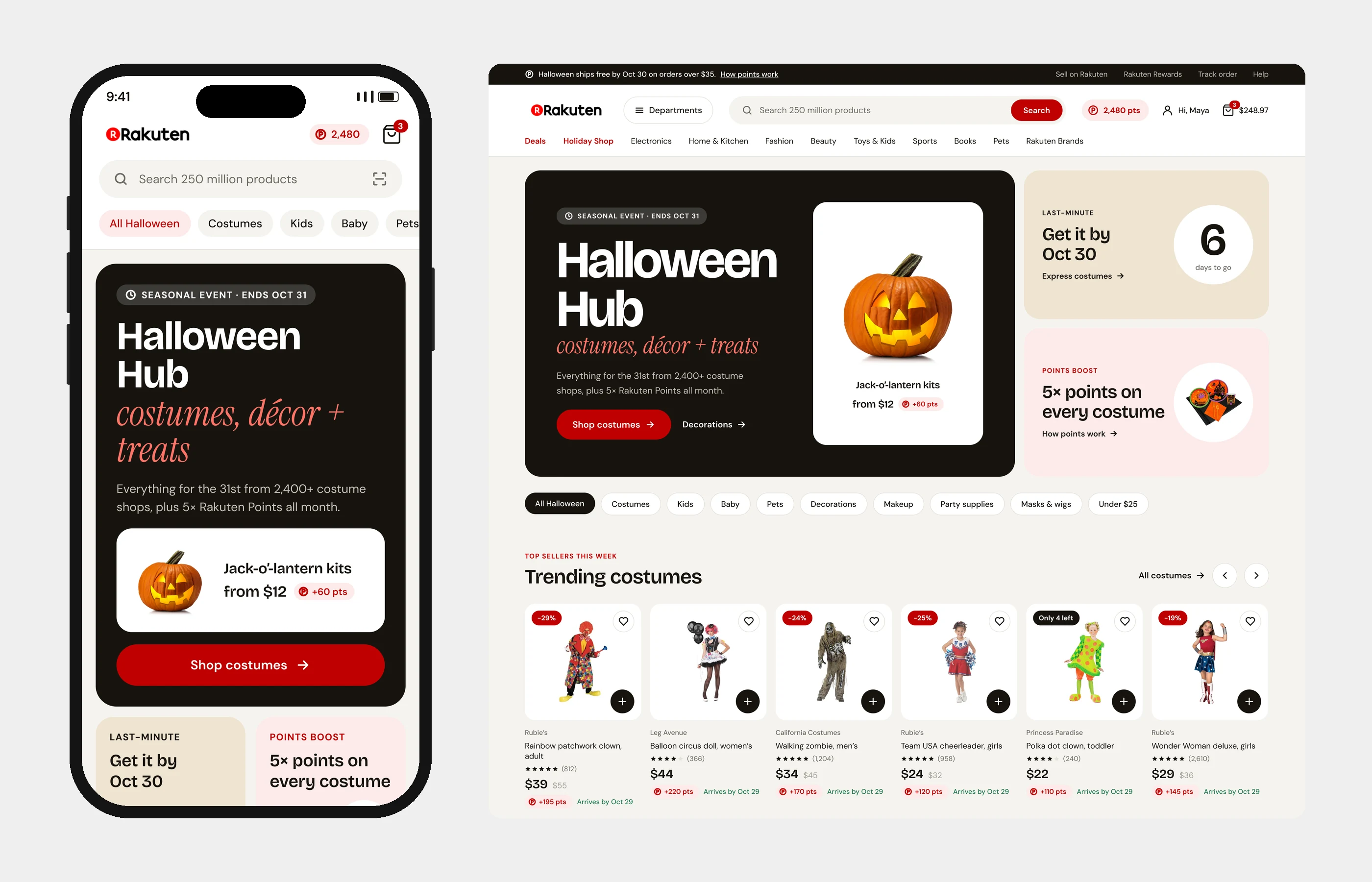
Points are Rakuten's biggest draw, but the old site barely showed them. Deals were baked into banner images and product cards showed little more than a photo and a price. On a marketplace with thousands of sellers, it was also hard to tell who you were buying from. So how do you make cash back count at the moment someone decides to buy?
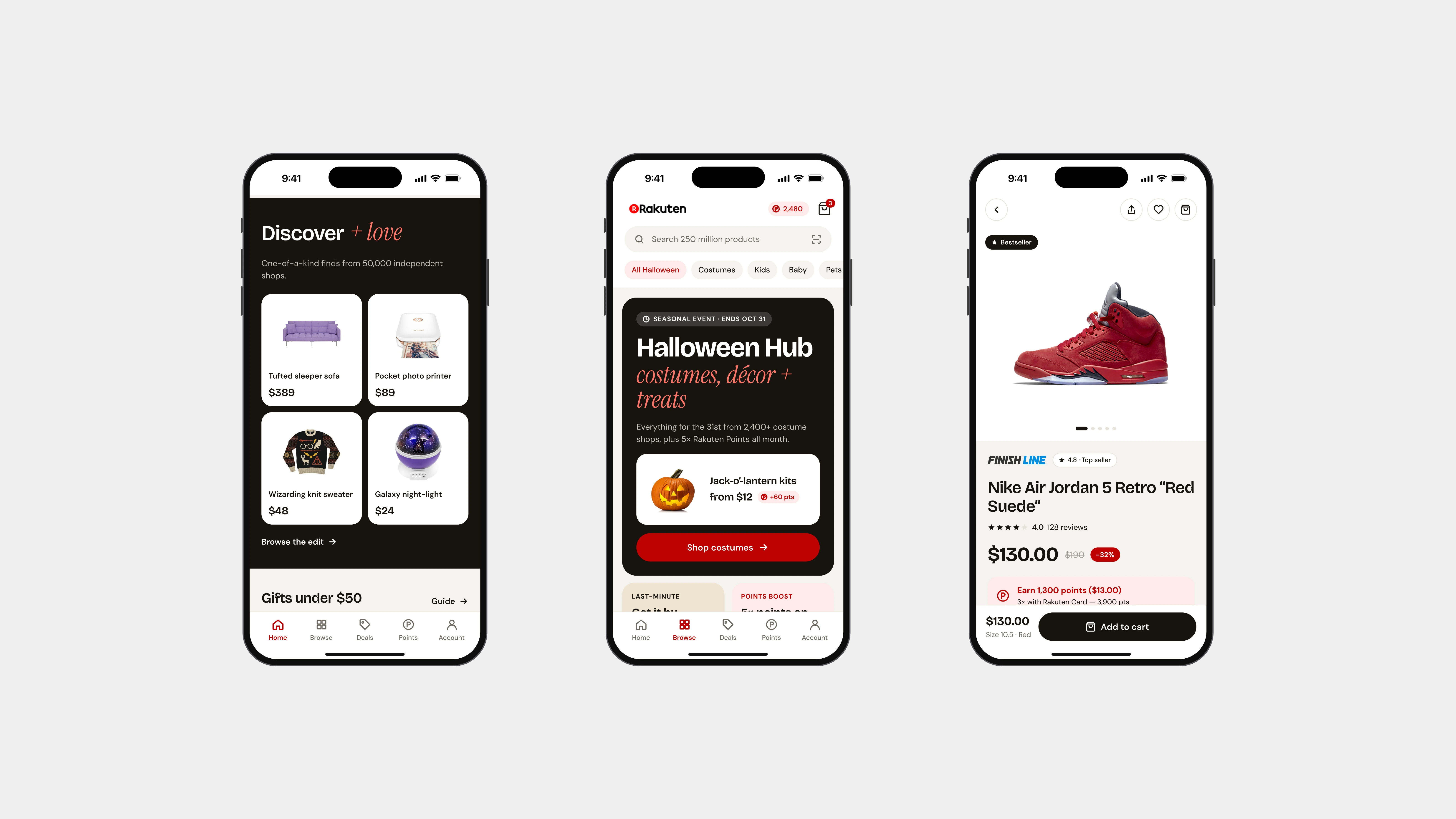
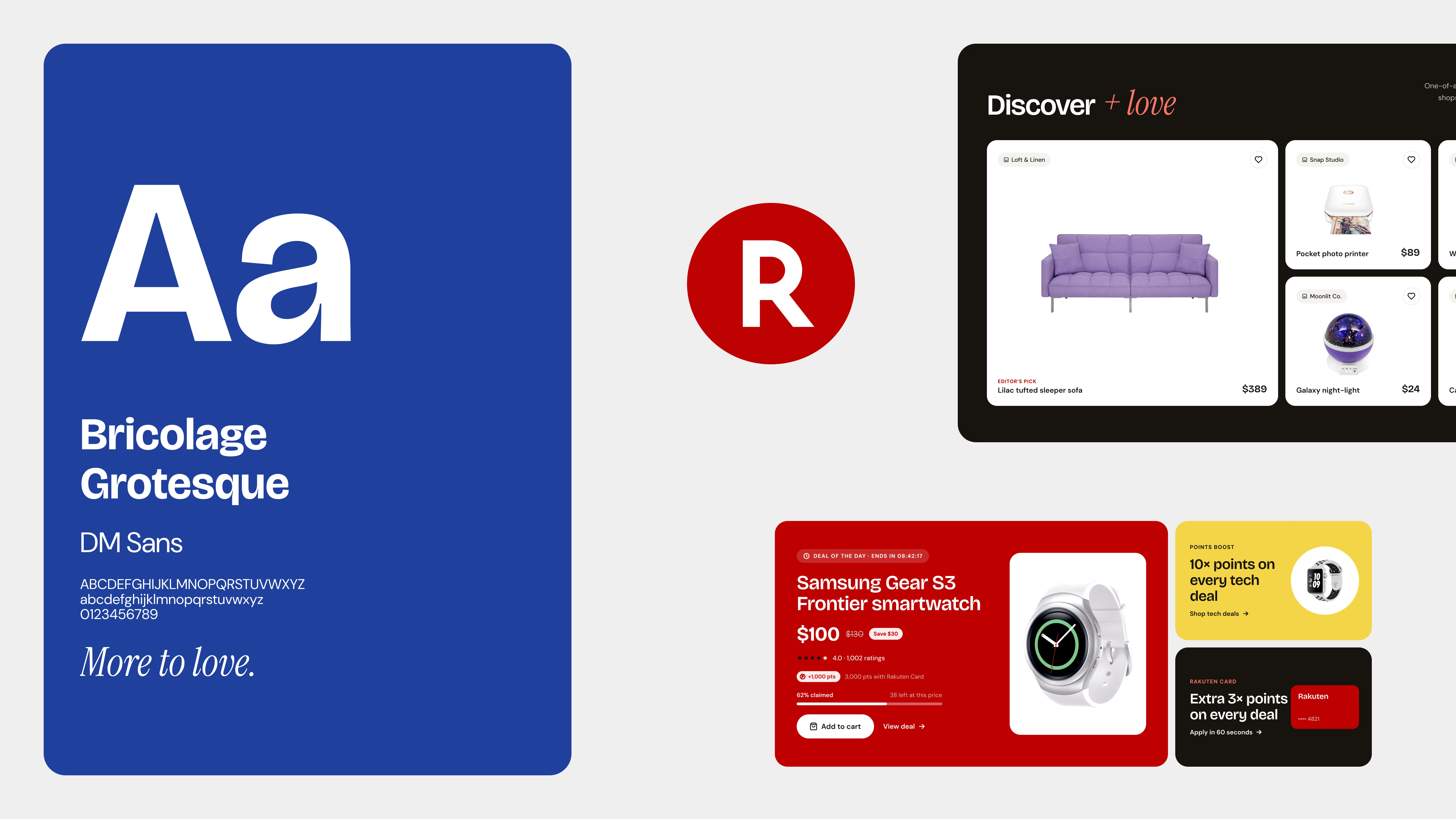
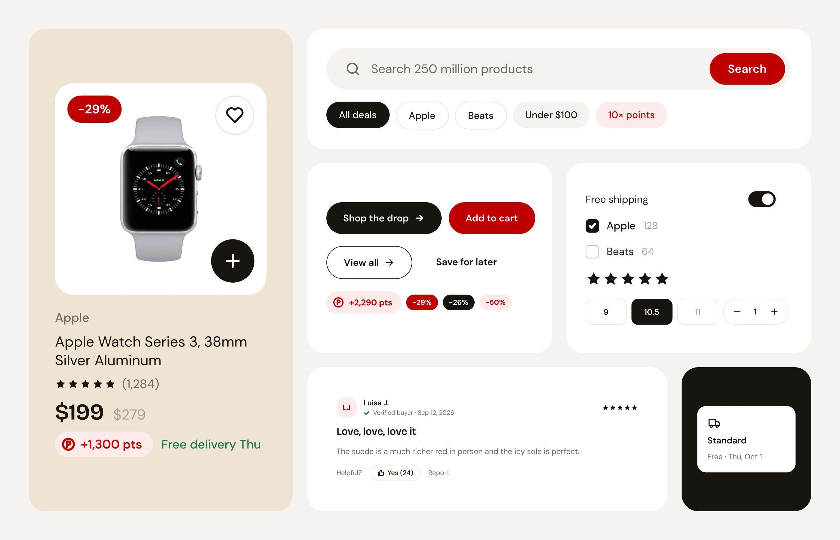
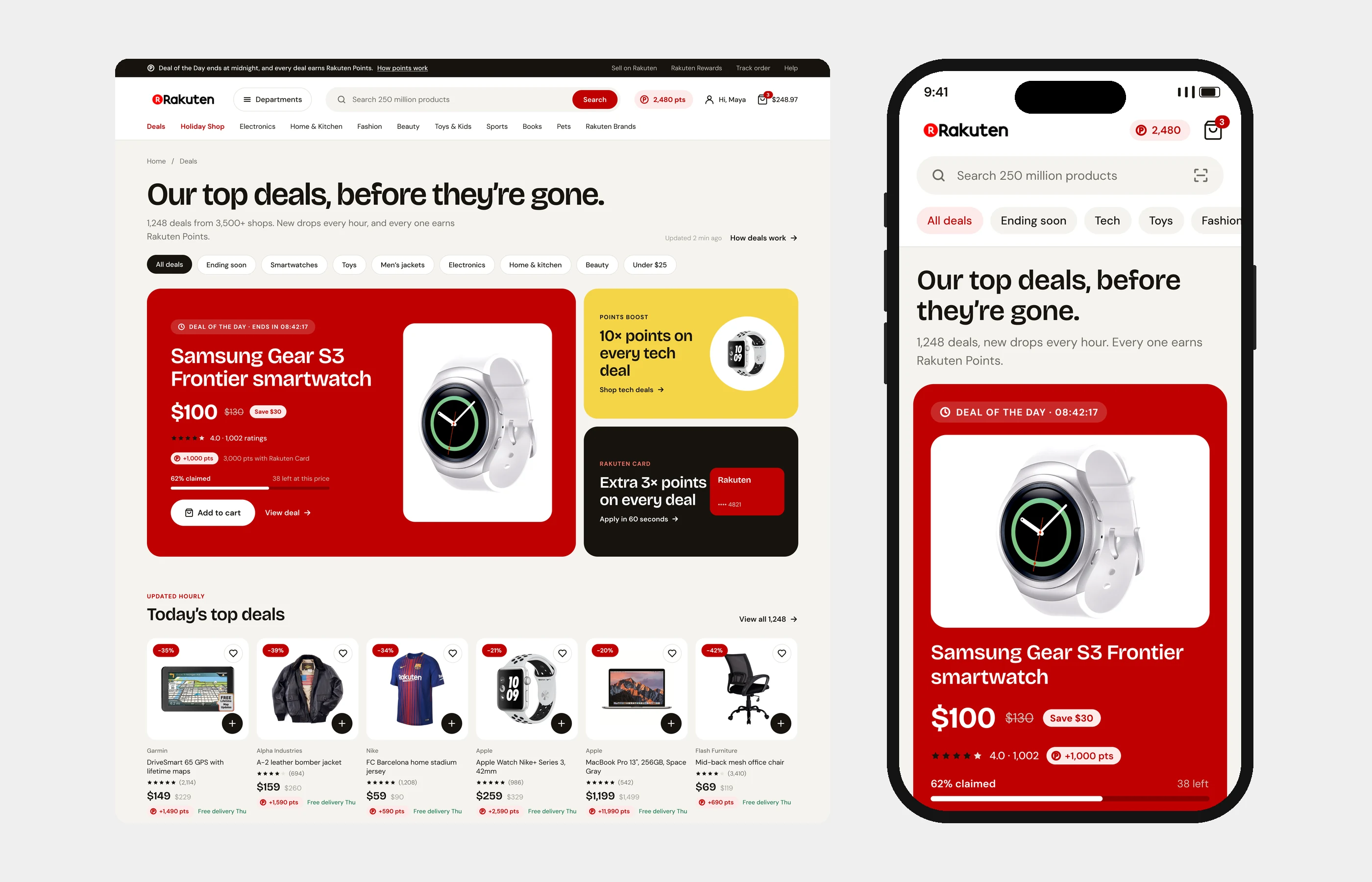
We put points wherever a shopper makes a choice: on every product card, in search results and next to the price. Seller, rating and delivery moved onto the product itself, so nobody has to dig to decide whether to trust it. Promotions that used to be text inside images are now live text, built from the same component library as the rest of the site. That library is also why new pages like Deals and the seasonal event hubs come together from parts we already had.